Änglamark
Brand Strategy
Design Strategy
Visual Identity
Packaging Design
Product Innovation
Sonic Brand
Event
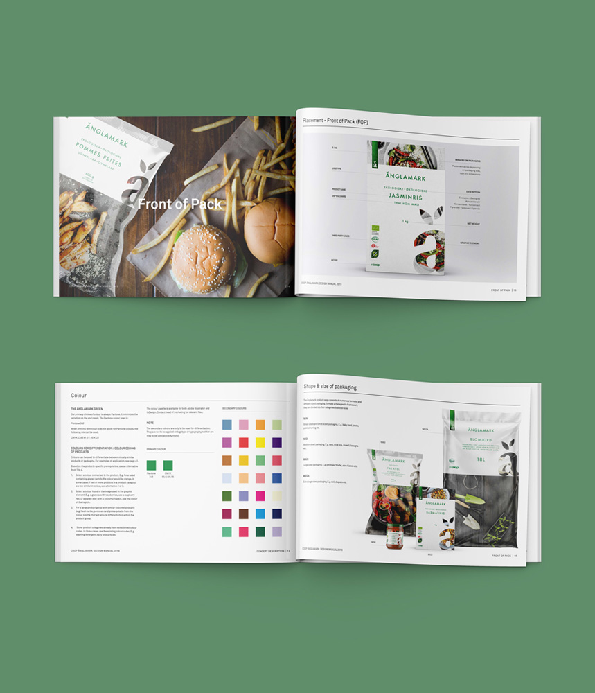
The packaging is white to communicate high quality. The white colour stands for transparency and purity of the product and production – Änglamark is real and don’t want to hide behind anything. A clean product that is produced fairly, by ecological farming and without preservatives.

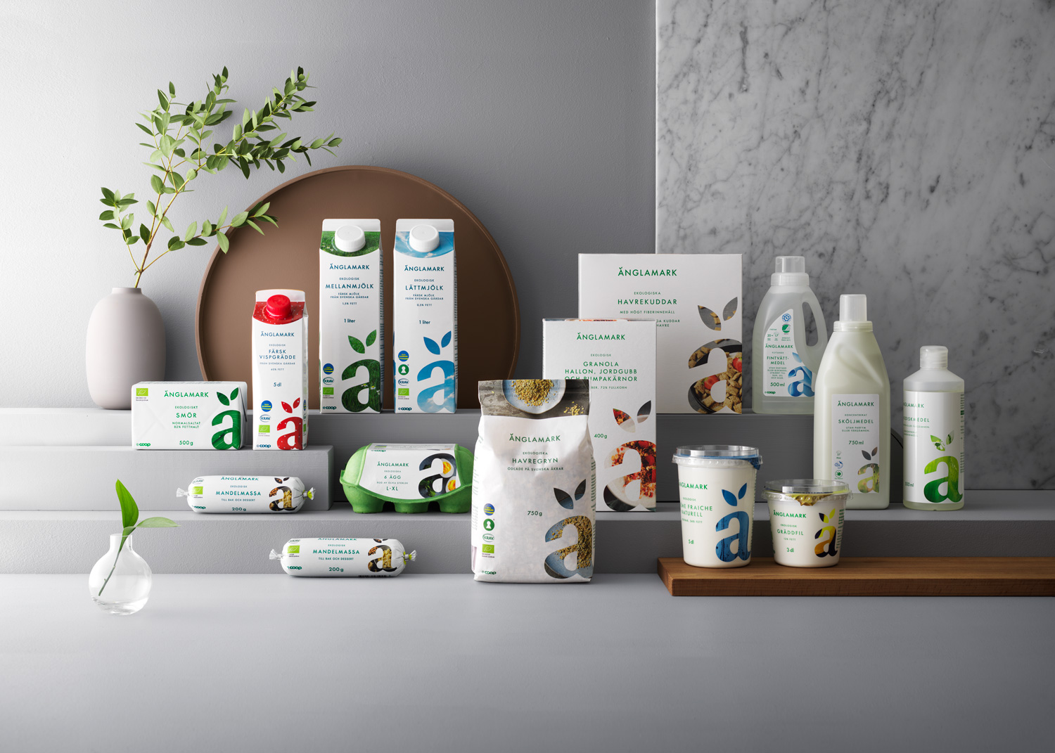
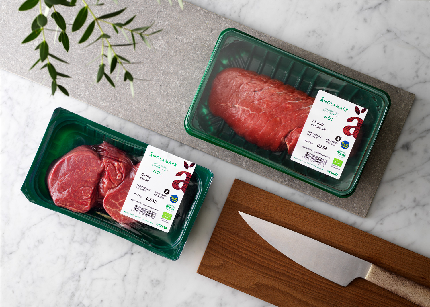
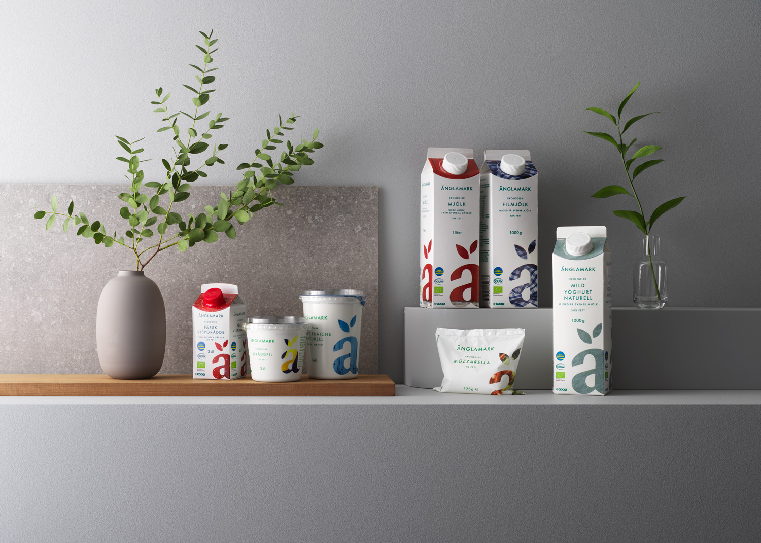
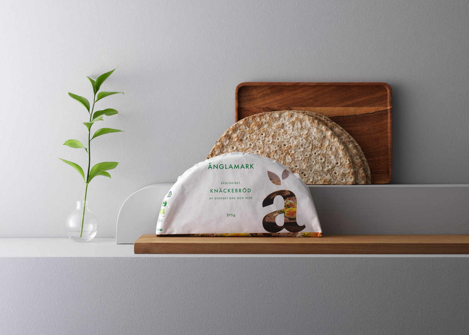
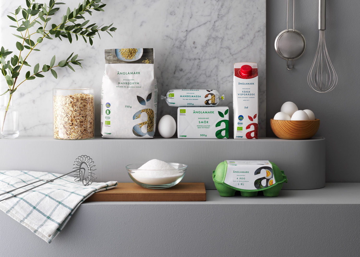
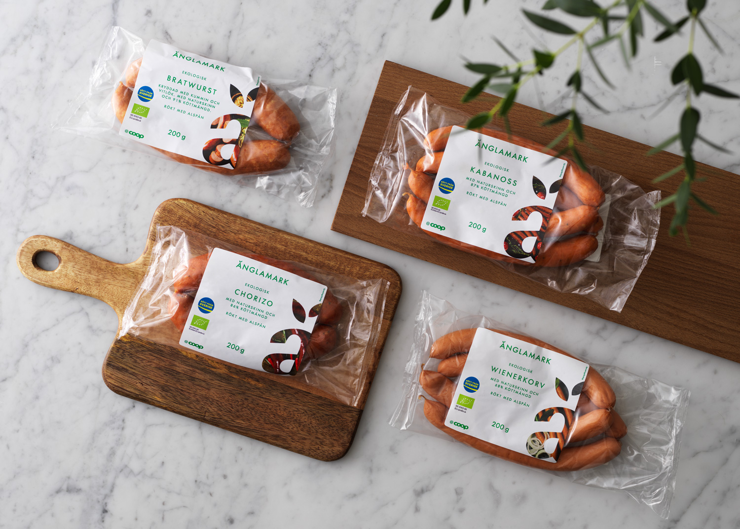
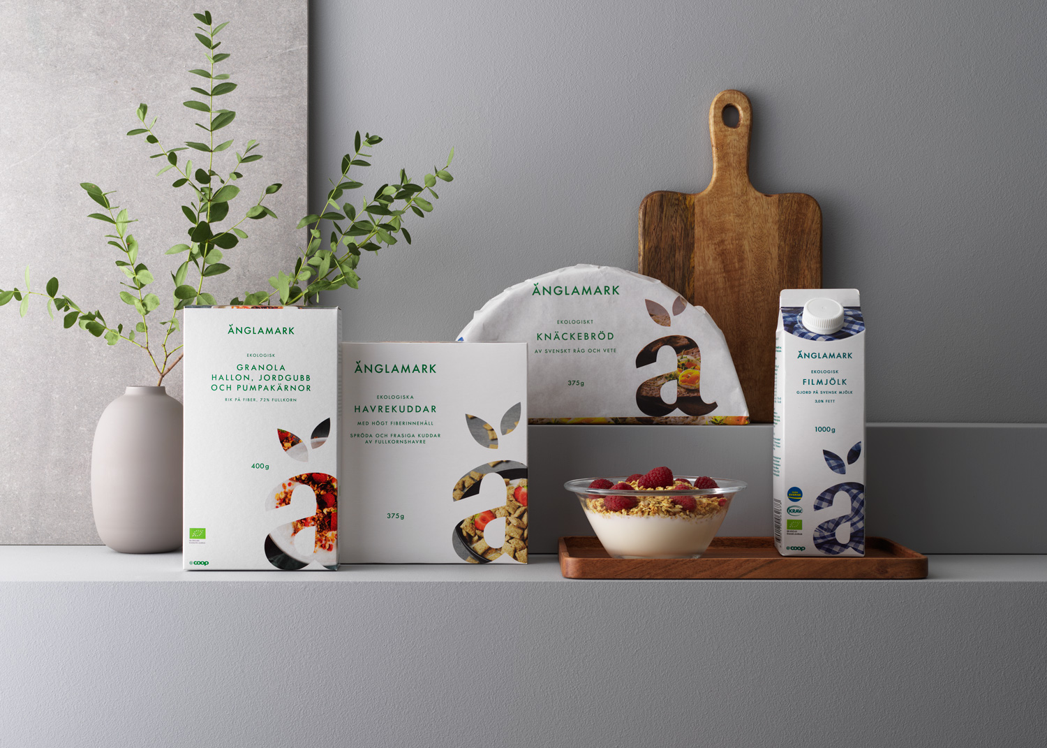
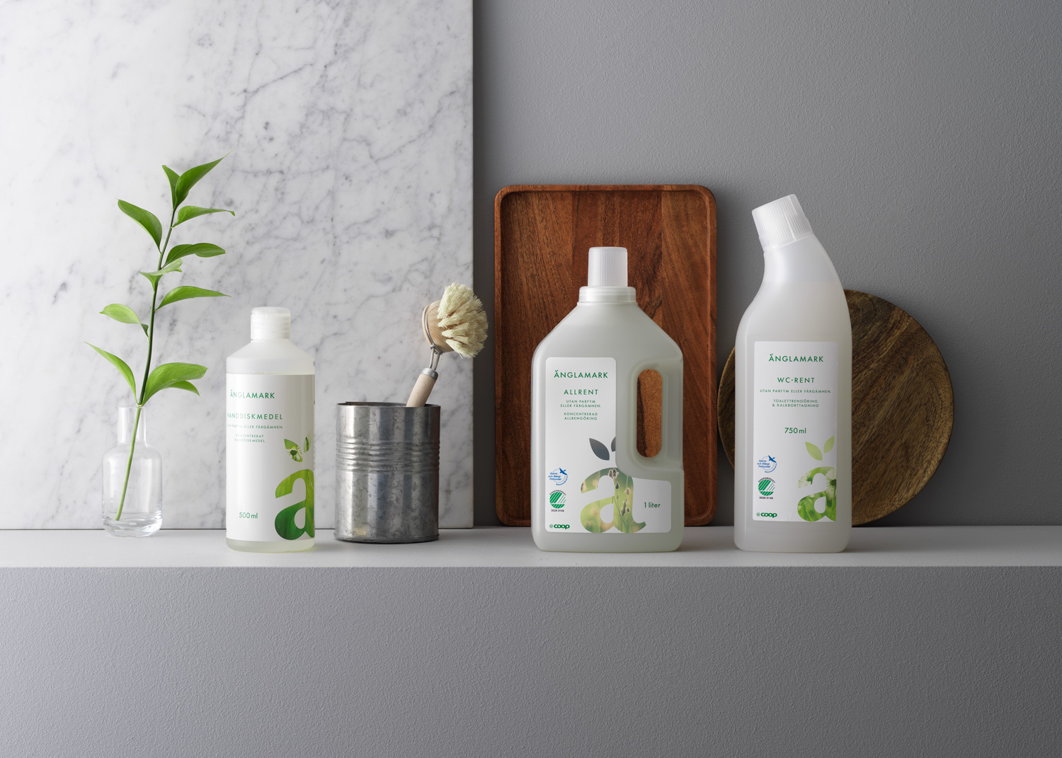
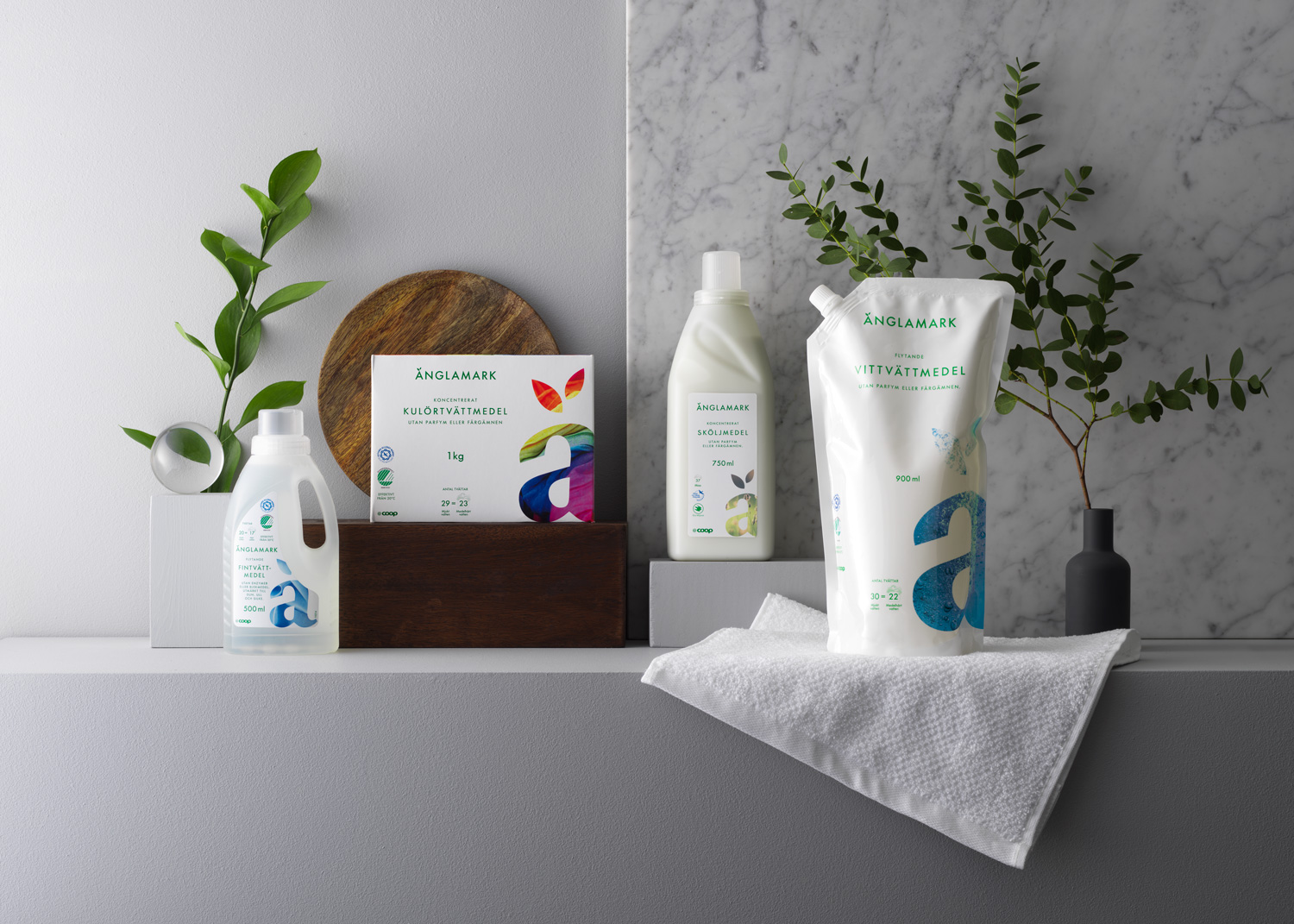
The revised design for Änglamark is built upon the pillars of Modernity, Differentiation, Attitude, Price Value and Food Appeal. The design elements used inted to enhance the design quality in relation to competition, as well as standing out in the store shelves.